
最小平方法擬合出一條回歸直線,讓我們可以從x來預測y。然而真實世界中,更多時候是資料分布不是線性關係,這時候如果用線性回歸強制擬合出一條直線來描述雙方關係,不僅勉強也影響預測力。這時候多項式就派上用場,甚至必要時可以使用廣義相加模型(Generalized Additive Model, GAM)。
為什麼不用線性回歸?
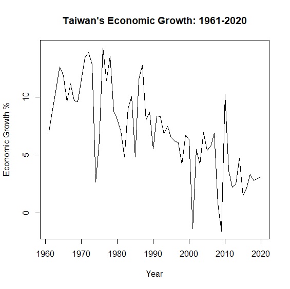
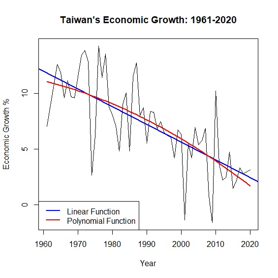
\(y=\alpha x + \beta\)是我們再熟悉不過的模型,但真實世界中更多是非線性相關。舉例來說,從中華民國統計資訊網的資料,我們可以畫出台灣1961至2020年超過半世紀的經濟成長率:
     > okun<-read.csv("c:/Users/USER/downloads/okun.csv", header=T, sep=",")

     > attach(okun)

     > plot(x=year, y=growth, type="l", main="Taiwan's Economic Growth: 1961-2020", xlab="Year", ylab="Economic Growth %")


     > linear<-lm(growth~year, data=okun)

     > summary(linear)$r.squared

     [1] 0.5211508
圖中可以看出經濟成長率的起伏很大,如果用一條回歸直線去描述半世紀以來的變動,回歸模型的解釋力只有0.52。面對這種情形,與其勉強用一條回歸直線,不如讓資料說真話,放棄線性模型另闢蹊徑。其中,多項式模型是一種解套方法。
多項式回歸
面對資料非線性的情況,當我們在擬合回歸模型的時候,刪除極端值是提高模型解釋力的一個方法,但如此不僅失真,實際上也不可能無限制刪除極端值,所以多項式回歸是一個可以提升模型配適度的方法。
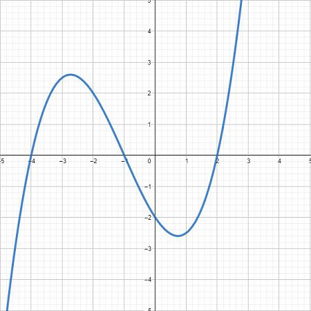
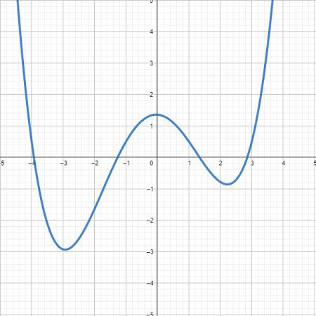
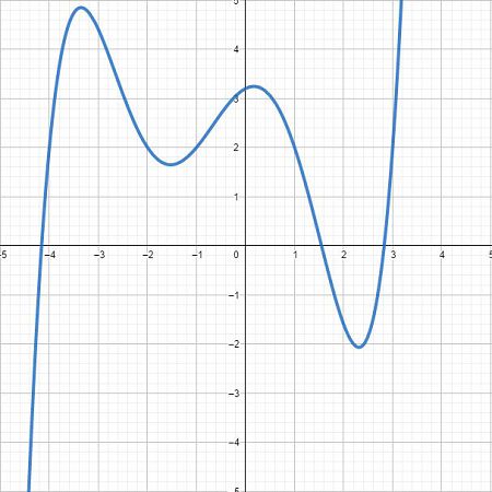
我們知道一元一次方程式\(y=\alpha x + \beta \)在平面座標上是一條直線,而一元二次方程式\(y=\alpha x^2 +\beta x + c\)是一條拋物線,隨著方程式的次數越高,曲線波動越明顯。如下圖所示,三次方後已經是一條波形的曲線。

我們可以利用多項式的特性,技巧性地在回歸模型中加入新的\(x^2\)變數,來擬合出一條接近資料分布的回歸模型,提高模型的解釋力。例如我們將原本的經濟成長率模型,加入\(x^2\)也就是年份的平方,讓回歸線變成一條拋物線。
     > year_square<-year^2 #計算年份平方

     > poly<-lm(growth~year+year_square, data=okun) #重新擬合二次回歸模型

     > summary(poly) #輸出結果

     Call:
     lm(formula = growth ~ year + year_square, data = okun)


     Residuals:
         Min      1Q  Median      3Q     Max
     -7.1383 -1.0583  0.2147  1.3079  6.3122


     Coefficients:
                   Estimate Std. Error t value Pr(>|t|)
     (Intercept) -5.031e+03  5.117e+03  -0.983    0.330
     year         5.221e+00  5.142e+00   1.015    0.314
     year_square -1.352e-03  1.292e-03  -1.046    0.300
     ---
     Signif. codes:  0 ‘***’ 0.001 ‘**’ 0.01 ‘*’ 0.05 ‘.’ 0.1 ‘ ’ 1


     Residual standard error: 2.683 on 57 degrees of freedom
     Multiple R-squared:  0.5302,    Adjusted R-squared:  0.5137
     F-statistic: 32.16 on 2 and 57 DF,  p-value: 4.468e-10
從結果可發現二次方程式回歸模型\(R^2=0.53\),與原本回歸模型\(R^2=0.52\)相較似乎改善一點,只不過自變數year變成不顯著。圖形上可以明顯看到本來的線性模型變成非線性:
     > predict_growth<-fitted(poly) #計算回歸模型預測的經濟成長率

     > plot(x=year, y=growth, main="Taiwan's Economic Growth: 1961-2020", xlab="Year", ylab="Economic Growth %", type="l") #繪製折線圖

     > abline(lm(growth~year), col="blue", lwd=2) #加上線性回歸直線,藍色,寬度2

     > lines(year, predict_growth, col="red", lwd=2) #加上二次曲線,紅色,寬度2

     > legend("bottomleft", legend=c("Linear Function", "Polynomial Function"), col=c("blue", "red"), lty=1, lwd=2) #加上圖說
上面的例子是將year平方,創造出另一個year_square變數,其實R有更方便的做法可以進行多項式回歸,透過I()或poly()來達到相同的結果:
     > poly<-lm(growth~year+I(year^2), data=okun)

     > poly<-lm(growth~poly(year, degree=2, raw=TRUE), data=okun)
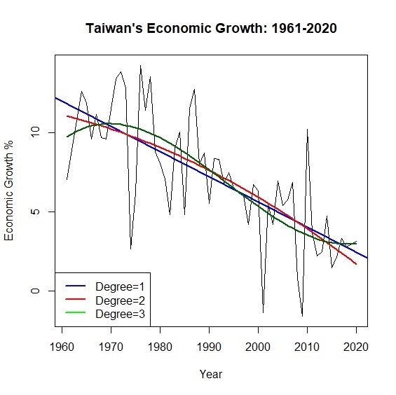
事實上隨著多項次的次方越高,模型的擬合度也就越好。例如當多項式來到\(x^3\)的時候,模型解釋力又再上升到\(R^2=0.55\)。不過因為多了\(x^2\),多項式回歸最大的問題是共線性,在模型上也比較難解釋。另外隨著次方越高,曲線在雙尾震盪的龍格現象(Runge Phenomenon)也會更加明顯。
     > poly3<-lm(growth~poly(year, degree=3, raw=TRUE), data=okun)

     > summary(poly3)$r.squared

     [1] 0.5508988
     > predict_growth2<-fitted(poly3)

     > plot(x=year, y=growth, type="l", main="Taiwan's Economic Growth: 1961-2020", xlab="Year", ylab="Economic Growth %")

     > abline(lm(growth~year), col="blue", lwd=2)

     > lines(year, predict_growth, col="red", lwd=2)

     > lines(year, predict_growth2, col="darkgreen", lwd=2)

     > legend("bottomleft", legend=c("Degree=1", "Degree=2", "Degree=3"), col=c("blue", "red", "green"), lty=1, lwd=2)
廣義相加模型
傳統回歸模型不適用於非線性的資料型態,多項式回歸又有侷限性,那麼到底有沒有方法可以擬合出一條曲線來涵蓋所有資料呢?答案是有的,就是廣義相加模型(Generalized Additive Model)。
我們熟悉的線性回歸方程式\(y=\alpha x + \beta\),等號右邊是估計參數\(\alpha\)與自變數\(x\),再加上一個常數項\(\beta\)。廣義相加模型等號右邊則是一連串平滑曲線函數,每一個自變數都被包含在\(s(x)\)裡面。可以想像廣義相加模型就是一個由數個光滑曲線所組成的模型,整個方程式會長成這樣:\(g(y)=s_{1}(x)+s_{2}(x)+\dots+s_{n}(x)\)。我們可以比較兩種模型的差異如下:
- 線性回歸模型:\(y=\beta_{0}+ \displaystyle\sum_{i=1}^n \beta_{i} x_{i} + \epsilon \)
- 廣義相加模型:\(y=\beta_{0}+ \displaystyle\sum_{i=1}^n s_{i}(x_{i}) + \epsilon \)
我們可以把廣義相加模型想像成一個由不同平滑曲線相加所構成的模型。例如\(g(y)=s_{1}(x)+s_{2}(x)+s_{3}(x)+s_{4}(x)\)可以想像成下圖:
過去線性回歸的重點在於找出\(\alpha\)與\(\beta\),從上述可知廣義相加模型的重點已經不是\(\alpha\)、\(\beta\),而是找出\(s(x)\)也就是平滑曲線(smooth function)。
平滑曲線
為什麼要找出一條平滑曲線?就像上面經濟成長率的例子,折線圖雖然可以看出趨勢但卻不容易預測\(x\)與\(y\)之間的關係,我們通常會希望\(x\)與\(y\)的關係會符合某種模式,可以是一條直線(linear),或是一條曲線(curve)。所以怎麼樣能讓折線變得「平滑」(smooth)一點,通常有下列幾種方法。
- 移動平均(Running Mean)
- 局部回歸(Local Regression, Loess)
- 樣條插值法(Spline Interpolation)
移動平均是最簡單能將一條折線修勻的方法,最常應用在股票分析。一個簡單移動平均(Simple Moving Average)公式如下:\(F_{t+1}=\frac{過去n期的總數}{n}\)。也就是第\(t+1\)期的移動平均,等於過去n期的算術平均。指數平滑法是另一個常用的技巧,通常能比簡單移動平均的線條再平滑些,其公式為:\(F_{t+1}=D_{t} + \alpha(F_{t}-D_{t})\)。其概念是透過\(\alpha\)參數,來調控預測值\(F_{t}\)與實際值\(D_{i}\)的誤差。TTR套件中有SMA()、EMA()可以計算移動平均。手動計算則可進一步參考SMA & EMA Step by Step。
基本原理是透過局部的線性回歸,串聯起一條平滑曲線。其概念有點像移動平均,只不過這個移動平均現在被回歸所取代而已。例如在散布圖中三個相鄰的資料點\((x_{1},y_{1})、(x_{2},y_{2})、(x_{3},y_{3})\)可以計算出一條回歸方程式,再根據這個回歸方程式計算出\(x_{2}\)所對應的\(y_{2}\)平滑值。然後依序再對\((x_{2},y_{2})、(x_{3},y_{3})、(x_{4},y_{4})\)作回歸,計算\(y_{3}\)的平滑值,以此類推下去。
通常採用Loess必須先決定每一段回歸線的鄰近區域大小,才能知道要取那些點計算回歸方程式。在局部加權回歸中,也會決定出一個加權函數,給予比較近的資料點有較大的權重,遠處的資料點有較小的權值。詳細步驟可參考Loess Step by Step。
所謂插值法就是找一個函數,穿過所有給定的函數值。看起來就像是在相鄰的函數值之間,插滿函數值,因而這條函數也稱為內插函數。最熟悉的莫過於牛頓插值法(Newton polynomial interpolation)與拉格朗日插值法(Lagrange polynomial interpolation),可參考插值法 Step by Step。
插值可以使用分段的多項式進行插值,比較常用的有三次樣條插值(cubic spline interpolation),其精神就在於兩個相鄰點之間,找出一個合理的三次多項式。概念如下圖並可以形成下列分段多項式。至於兩條相鄰曲線之間的銜接點─節點(knot)必須平滑,只要令其一階導函數和二階導函數值相等即可。
\[S(x)= \begin{cases} s_{1}=\beta_{0} + \beta_{1} x^3 + \beta_{2} x^2 + \beta_{3} x\\ s_{2}=\beta_{0} + \beta_{1} x^3 + \beta_{2} x^2 + \beta_{3} x\\ s_{3}=\beta_{0} + \beta_{1} x^3 + \beta_{2} x^2 + \beta_{3} x \end{cases} \]
在擬合三次樣條的過程中,當然不可能把所有的函數點都插值,我們希望擬合出來的線條能趨近真實資料的分布型態,不會出現過度擬合(overfitted)或擬合不足(underfitted)。為了避免這種情形,除了要考慮殘差的最小平方之外,還要考慮曲線的平滑程度。曲線波動太大(wiggling),容易受到離群值得影響,降低模型解釋力;曲線太過平滑,又會失去曲線模型的意義。為了解決這個兩難,我們在最小平方的後面多加了一個「懲罰項」(penality):\(\lambda\int(s''(x))^2\mathrm{d}x\),所以模型擬合出來的曲線會變成:
\[\sum_{i=1}^{n}(y_{i}-f(x_{i}))^2+\lambda\int(s''(x))^2\mathrm{d}x\]
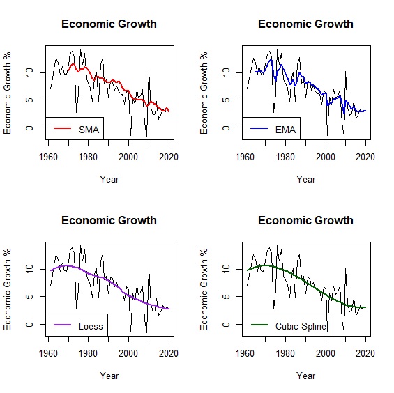
懲罰項是平滑曲線二階導數的積分。一階導數是曲線的斜率,二階導數是斜率的斜率,也就是斜率的變化率,換句話說如果曲線波動很大的話,二階導數也會很大,如果一條直線的話那麼二階導數為0。取積分的意義可以想像是把「斜率的變化率」面積加總,如此一來就可以衡量平滑曲線的波動程度。在數學涵義上,加入一個\(\lambda\)參數來控制懲罰項,讓我們更容易決定曲線的波動程度。當\(\lambda=0\),懲罰項為0,擬合點過多造成曲線節點(knot)太多波動太大,也就是過度擬合;反之\(\lambda\)趨近於無限大,則會接近一條直線,也就是擬合不足。一般情況,我們會設定\(\lambda=0.6\)或是讓R自行調整。比較移動平均、局部回歸與三次樣條擬合的情形如下:
     > loess<-loess(growth~year, data=okun, span=0.6) #局部回歸模型

     > fit_loess<-fitted(loess) #估計局部回歸模型的經濟成長率

     > library(splines) #載入splines套件

     > cubic<-lm(growth~bs(year, knots=6, degree=3), data=okun) #三次樣條模型

     > fit_cubic<-fitted(cubic) #估計三次樣條模型的經濟成長率

     > library(TTR) #載入TTR套件

     > sma<-SMA(okun[,"growth"], n=10) #計算10年移動平均

     > ema<-EMA(okun[,"growth"], ratio=0.3) #計算指數移動平均

     > par(mfrow=c(2,2)) #設定圖表輸出版型為2x2

     > plot(x=okun$year, y=okun$growth, type="l", main="Economic Growth", xlab="Year", ylab="Economic Growth %") #繪製折線圖

     > lines(year, sma, col="red", lwd=2) #加上移動平均趨勢線

     > legend("bottomleft", legend=c("SMA"), col=c("red"), lty=1, lwd=2) #圖例

     > plot(x=okun$year, y=okun$growth, type="l", main="Economic Growth", xlab="Year", ylab="Economic Growth %") #繪製折線圖

     > lines(year, ema, col="blue", lwd=2) #加上指數移動平均趨勢線

     > legend("bottomleft", legend=c("EMA"), col=c("blue"), lty=1, lwd=2) #圖例

     > plot(x=okun$year, y=okun$growth, type="l", main="Economic Growth", xlab="Year", ylab="Economic Growth %") #繪製折線圖

     > lines(year, fit_loess, col="purple", lwd=2) #加上局部回歸趨勢線

     > legend("bottomleft", legend=c("Loess"), col=c("purple"), lty=1, lwd=2) #圖例

     > plot(x=okun$year, y=okun$growth, type="l", main="Economic Growth", xlab="Year", ylab="Economic Growth %") #繪製折線圖

     > lines(year, fit_cubic, col="darkgreen", lwd=2) #加上三次樣條趨勢線

     > legend("bottomleft", legend=c("Cubic Spline"), col=c("darkgreen"), lty=1, lwd=2) #圖例
模型試作
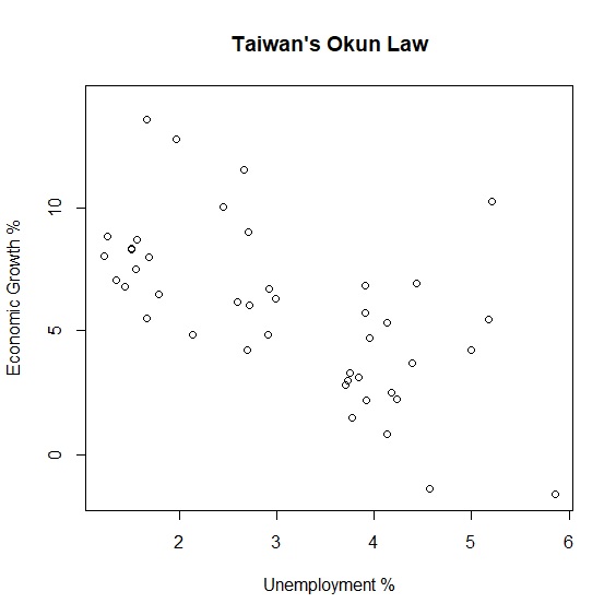
瞭解廣義相加模型的概念後,我們以奧肯法則(Okun's Law)實際例子來驗證廣義相加模型。奧肯法則是美國經濟學家Arthur Okun在1962年提出失業率與經濟成長率的反向關係。如果適用到台灣是不是也是如此呢?下圖呈現半世紀以來台灣失業率與經濟成長率的變動,可以看出兩者大抵呈現反向關係。
> plot(x=unemployment, y=growth, main="Taiwan's Okun Law", xlab="Unemployment %", ylab="Economic Growth %")
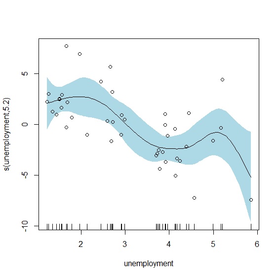
我們試著以廣義相加模型來擬合兩項變數。mgcv套件是R執行廣義相加模型最重要的套件,載入mgcv後以gam()重新擬合兩項變數:
     > library(mgcv) #載入mgcv套件

     > okun_new<-okun[complete.cases(okun),]

     > attach(okun_new)

     > gam<-gam(growth~s(unemployment), data=okun_new) #廣義相加模型

     > summary(gam)

     Family: gaussian
     Link function: identity


     Formula:
     growth ~ s(unemployment)


     Parametric coefficients:
                 Estimate Std. Error t value Pr(>|t|)
     (Intercept)   5.8447     0.3786   15.44   <2e-16 ***
     ---
     Signif. codes:  0 ‘***’ 0.001 ‘**’ 0.01 ‘*’ 0.05 ‘.’ 0.1 ‘ ’ 1


     Approximate significance of smooth terms:
                       edf Ref.df     F  p-value
     s(unemployment) 5.202  6.296 5.773 0.000209 ***
     ---
     Signif. codes:  0 ‘***’ 0.001 ‘**’ 0.01 ‘*’ 0.05 ‘.’ 0.1 ‘ ’ 1
     R-sq.(adj) =   0.45   Deviance explained = 51.8%
     GCV = 7.2019  Scale est. = 6.1632    n = 43
GAM的輸出報表大致分為五個部分。
- 連結函數 (link function)
- 方程式 (Formula)
- 參數 (parametric coefficients)
- 平滑曲線 (smooth terms)
- 解釋力
模型的連結函數。現在這個模型是高斯分配(gaussian),但如果應變數是類別變數,GAM其實也可以改為其他類型的分配。
說明模型之間的變數關係,也就是方程式長什麼樣子。
這是我們熟悉的部分,和過去回歸模型的內容一樣,可以看到常數項是5.8447。
GAM最重要的部分。可以看到smooth term已經沒有預測參數,而是以effective degrees of freedom(edf)來代替。edf是GAM的統計量,反應的是非線性的程度,通常edf越大代表模型越複雜,非線性的情況越明顯;反之當edf=1的時候,代表兩者是線性相關,也就是跟一般的回歸模型一樣。
最後一部分是模型解釋力,可以看到\(R^2=0.45\)。
plot.gam()輸出廣義相加模型的平滑曲線如下:
> plot.gam(gam, residuals=TRUE, pch=1, shade=TRUE, shade.col="lightblue")
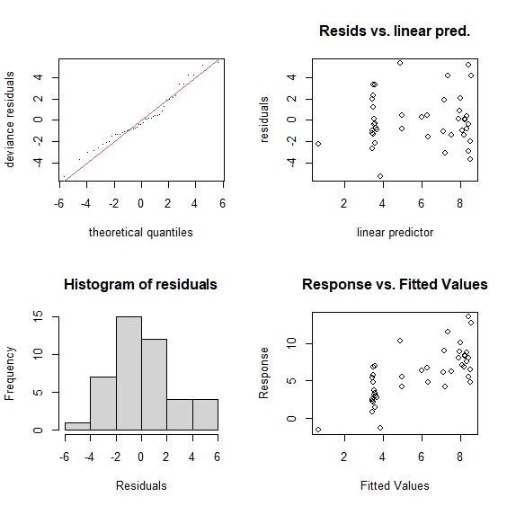
gam.check()輸出模型檢定報表。報表第一段說明檢定的方法是「廣義交叉驗證」(Generalised Cross-Validation, GCV),GCV是用來選擇平滑參數\(\lambda\)的指標,與AIC一樣GCV的數值越小表示模型越佳。gam()會自動透過最小誤差或最大概似法,替每個模型找到適合的平滑參數。GCV的原理是誤差極小化來決定平滑參數,這也是gam()預設的方法。但多數人認為GCV模型有平滑不足(undersmoothing)的問題,因此更推薦使用有限最大概似法(restricted maximum likelihood, REML)來決定平滑參數。
報表第二段是基底函數(Basis Functions)K的檢驗結果。實務上K決定了模型自由度(degree of freedom)的上限,也就是K值越大,模型的自由度越大。所以當K越大,也就是基底函數越多,越能正確勾勒出平滑曲線。不過就像前面提到的,gam()在透過GCV或REML找到適合的平滑參數,已經決定模型的自由度,所以一般情況下K不太需要調整。但是當基底函數太少的時候,模型的平滑度通常不會太好,震盪會比較明顯,特別是一旦自變數增加的時候,可能需要手動調整基底函數,直到模型的p值不顯著為止。
在我們的模型中,k=9,p值不顯著,顯示模型通過統計檢驗。gam.check()也會同時輸出四張殘差檢定圖,這部分與線性回歸模型相同。
     > gam.check(gam)


     Method: GCV   Optimizer: magic
     Smoothing parameter selection converged after 5 iterations.
     The RMS GCV score gradient at convergence was 0.0003435376 .
     The Hessian was positive definite.
     Model rank =  10 / 10


     Basis dimension (k) checking results. Low p-value (k-index<1) may
     indicate that k is too low, especially if edf is close to k'.


                      k' edf k-index p-value
     s(unemployment) 9.0 5.2    1.42    0.99
廣義相加模型的優勢在於面對非線性的資料,比傳統線性模型有更佳的配適度與解釋例。不同模型比較中可以看見廣義相加模型的優勢,無論是在\(R^2\)或AIC(Akaike Information Criterion)都有較好的表現:
     > linear<-lm(growth~unemployment, data=okun)

     > poly<-lm(growth~poly(unemployment, degree=2, raw=TRUE), data=okun)

     > cubic<-lm(growth~bs(unemployment), data=okun)

     > summary(linear)$r.squared

     [1] 0.37149
     > summary(poly)$r.squared

     [1] 0.3743529
     > summary(cubic)$r.squared

     [1] 0.3837308
     > summary(gam)$r.sq

     [1] 0.450145
     > AIC(linear)

     [1] 210.9652
     > AIC(poly)

     [1] 212.7689
     > AIC(cubic)

     [1] 214.1195
     > AIC(gam)

     [1] 207.9345
| Model | \(R^2\) | AIC |
|---|---|---|
| Linear | 0.37 | 210.97 |
| Polynomial | 0.37 | 212.77 |
| Cubic | 0.38 | 214.12 |
| GAM | 0.45 | 207.93 |
除了比較\(R^2\)與AIC外,其實也可以ANOVA來比較模型差異:
     > anova(linear, gam, test="Chisq")

     Analysis of Variance Table


     Model 1: growth ~ unemployment
     Model 2: growth ~ s(unemployment)
       Res.Df    RSS    Df Sum of Sq Pr(>Chi)
     1 41.000 295.88
     2 36.798 226.79 4.202    69.089  0.02812 *
     > anova(poly, gam, test="Chisq")

     Analysis of Variance Table


     Model 1: growth ~ poly(unemployment, degree = 2, raw = TRUE)
     Model 2: growth ~ s(unemployment)
       Res.Df    RSS    Df Sum of Sq Pr(>Chi)
     1 40.000 294.53
     2 36.798 226.79 3.202    67.741  0.01411 *
     > anova(cubic, gam, test="Chisq")

     Analysis of Variance Table


     Model 1: growth ~ bs(unemployment)
     Model 2: growth ~ s(unemployment)
       Res.Df    RSS    Df Sum of Sq Pr(>Chi)
     1 39.000 290.12
     2 36.798 226.79 2.202    63.326  0.00741 **
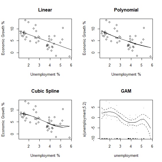
最後我們直接以視覺化來比較不同模型擬合的結果:
     > linear<-lm(growth~unemployment, data=okun_new)

     > poly<-lm(growth~poly(unemployment, degree=2, raw=TRUE), data=okun_new)

     > cubic<-lm(growth~bs(unemployment), data=okun_new)

     > fit_poly<-fitted(poly)

     > fit_cubic<-fitted(cubic)

     > par(mfrow=c(2,2))

     > plot(x=unemployment, y=growth, main="Linear", xlab="Unemployment %", ylab="Economic Growth %")

     > abline(lm(growth~unemployment))

     > plot(x=unemployment, y=growth, main="Polynomial", xlab="Unemployment %", ylab="Economic Growth %")

     > lines(unemployment, fit_poly)

     > plot(x=unemployment, y=growth, main="Cubic Spline", xlab="Unemployment %", ylab="Economic Growth %")

     > lines(unemployment, fit_cubic)

     > plot.gam(gam, residuals=TRUE, main="GAM")
與線性回歸相同,predict.gam()可以用來估計未來的情況。假設失業率為4.80、3.91、3.73、3.71、3.76,估計經濟成長率為:
     > var.unemployment<-data.frame(unemployment=c(4.80,3.91,3.73,3.71,3.76))

     > predict.gam(gam, newdata=var.unemployment)

            1        2        3        4        5
     4.561867 3.490964 3.641897 3.669994 3.604767
交互作用
廣義相加模型與多元回歸一樣,也可以包含許多\(s(x)\),甚至是\(s(x_{1}, x_{2})\)交互作用項。根據經濟學法則GDP = C + I + G + NX,我們以儲蓄率與投資率為例重新建立經濟成長率模型,並增加儲蓄率與投資率的交互作用項。
     > gam2<-gam(growth~s(save)+s(investment)+s(save, investment), data=okun, method="REML")

     > summary(gam2)

     Family: gaussian
     Link function: identity


     Formula:
     growth ~ s(save) + s(investment) + s(save, investment)


     Parametric coefficients:
                 Estimate Std. Error t value Pr(>|t|)
     (Intercept)   7.1472     0.3177    22.5   <2e-16 ***
     ---
     Signif. codes:  0 ‘***’ 0.001 ‘**’ 0.01 ‘*’ 0.05 ‘.’ 0.1 ‘ ’ 1


     Approximate significance of smooth terms:
                           edf Ref.df      F  p-value
     s(save)            5.214  6.183 2.866  0.0158 *
     s(investment)      3.188  3.844 2.897  0.0368 *
     s(save,investment) 2.107 27.000 0.112  0.0729 .
     ---
     Signif. codes:  0 ‘***’ 0.001 ‘**’ 0.01 ‘*’ 0.05 ‘.’ 0.1 ‘ ’ 1


     R-sq.(adj) =  0.591   Deviance explained = 66.4%
     -REML = 147.97  Scale est. = 6.0548    n = 60
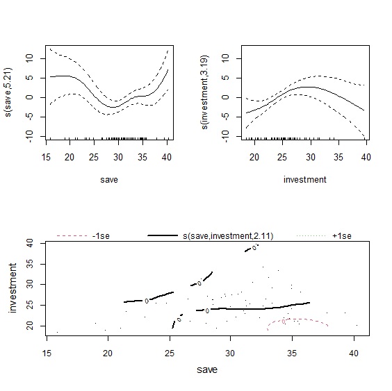
plot()輸出模型擬合結果,因為有三個自變數,因此共會輸出三張圖表。左上是儲蓄率的平滑曲線,右上是投資率的平滑曲線,下圖則是以等高線圖(contour)來呈現兩者的交互作用。從圖形來看,儲蓄率對經濟成長率的影響是先下降再上升,而投資率則是先上升後下降。至於交互作用項從等高線圖難以判別,我們可以改用3D圖來觀察。
     > layout(matrix(c(1,2,3,3), 2, 2, byrow=TRUE))

     > plot(gam2)
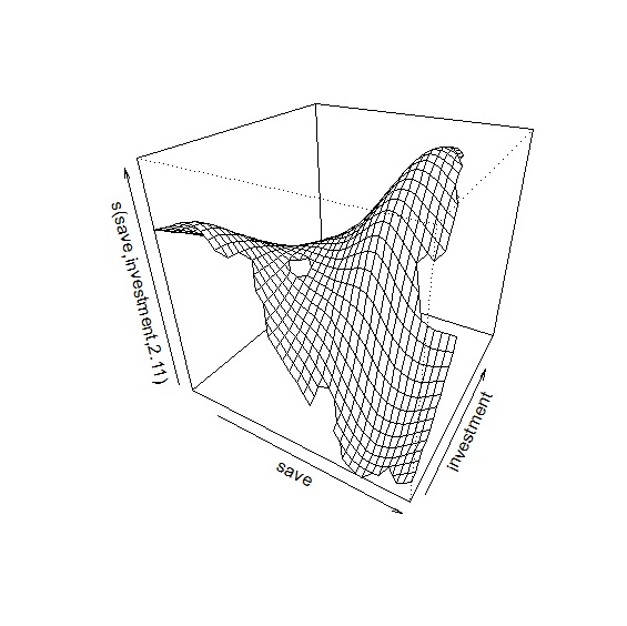
在plot()中加入scheme=1參數,可輸出交互作用3D圖。圖中顯示當儲蓄率高,投資率低的時候,對經濟成長率有負面影響;儲蓄率適中,投資率高對經濟成長率是最佳情況。
> plot(gam2, scheme=1)
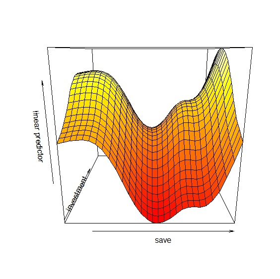
除了plot()之外vis.gam()則可以繪製兩變數之間的透視圖:
> vis.gam(gam2, view=c("save", "investment"), plot.type="persp")
\(s(x_{1}, x_{2})\)當作交互作用項的時候,整個平滑曲線只有一個\(\lambda\)參數,當\(x_{1}\)與\(x_{2}\)單位相同的時候,共用\(\lambda\)參數並無不可,不過如果兩個變數單位不同的時候,共用同一個\(\lambda\)參數就顯得有些奇怪了。這時候就可以引進tensor來建構模型。用下面的方程式更能瞭解兩種交互作用模型的差異:
\[\text{原始模型: }y=s(x_{1})+s(x_{2})+s(x_{1}, x_{2}) \text{ with } \lambda_{1}, \lambda_{2}, \lambda_{3}\]
\[\text{Tensor模型: }y=s(x_{1})+s(x_{2})+ti(x_{1}, x_{2}) \text{ with } \lambda_{1}, \lambda_{2}, \lambda_{3}, \lambda_{4}\]