散布圖是常見的統計圖,用來觀察兩個變數的關聯,是計算共變數、相關係數、回歸線的重要圖表。在R Base裡的繪圖指令是用plot()並搭配type="p"參數來指定劃出資料點(point)。ggplot2的geom_point()指令則更一目瞭然。
散布圖
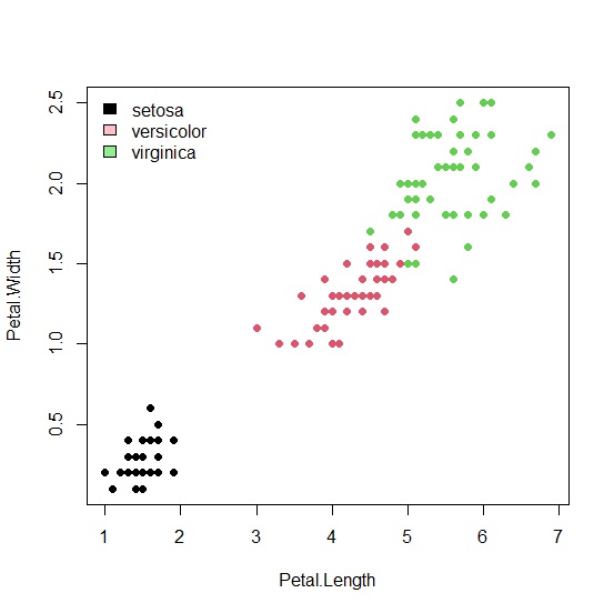
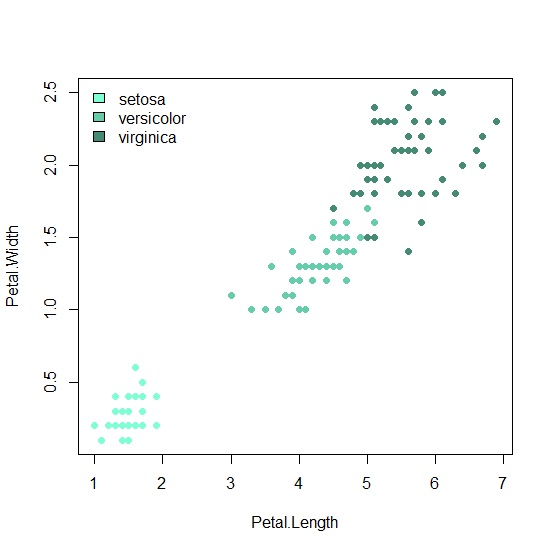
我們以R最著名的範例資料檔鳶尾花為例,說明散布圖的繪製。plot()設定好x軸與y軸,以花種作為顏色分類後,R會自動繪出散布圖。
     > data("iris")

     > attach("iris")])

     > plot(Petal.Length, Petal.Width, type="p", pch=16, col=Species)

     > legend("topleft", legend=c("setosa", "versicolor", "virginica"), fill=c("black", "pink", "lightgreen"), bty="n")
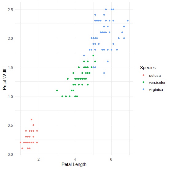
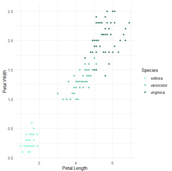
ggplot2繪製散布圖的指令是geom_point(),一樣設定xy軸後,以花種作為顏色分類後繪出散布圖。
     > p<-ggplot(iris, aes(x=Petal.Length, y=Petal.Width, color=Species))+

     + geom_point()+

     + theme_minimal()

     > p
如果想要指定顏色,在R Base中可以在col參數後面加上[variable]來設定。
     > plot(Petal.Length, Petal.Width, type="p", pch=16, col=c("aquamarine","aquamarine3","aquamarine4")[Species])

     > legend("topleft", legend=c("setosa", "versicolor", "virginica"), fill=c("aquamarine", "aquamarine3", "aquamarine4"), bty="n")
在ggplot2中,只要用scale_color_manual()設定顏色即可。
     > p<-ggplot(iris, aes(x=Petal.Length, y=Petal.Width))+

     + geom_point(aes(color=Species))+

     + scale_color_manual(label=c("setosa","versicolor","virginica"),values=c("aquamarine","aquamarine3","aquamarine4"))+

     + theme_minimal()

     > p
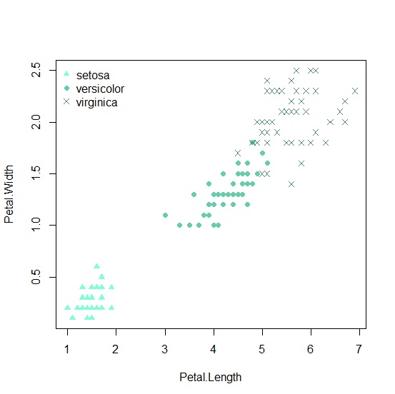
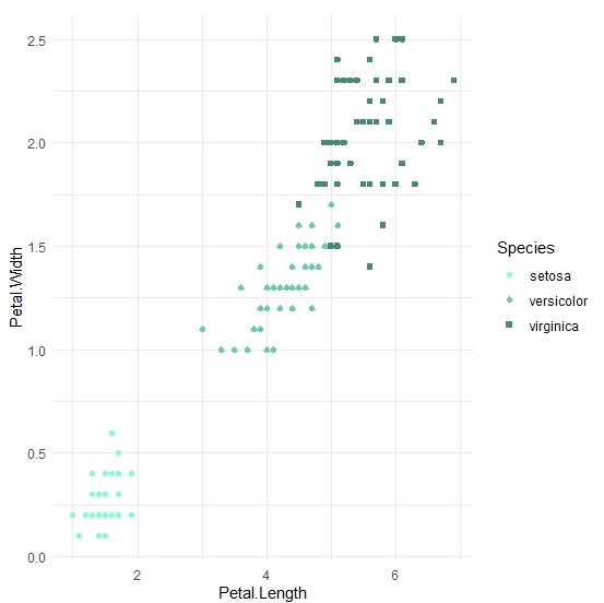
也可以用些小技巧讓資料點長得不一樣更容易區分花種。在R Base中是用pch=[variable],ggplot2則是加上shape參數。
     > plot(Petal.Length, Petal.Width, type="p", pch=c(17,16,4)[Species], col=c("aquamarine","aquamarine3","aquamarine4")[Species])

     > legend("topleft", legend=c("setosa", "versicolor", "virginica"), pch=c(17,16,4), col=c("aquamarine", "aquamarine3", "aquamarine4"), bty="n")
     > p<-ggplot(iris, aes(x=Petal.Length, y=Petal.Width))+

     + geom_point(aes(color=Species, shape=Species))+

     + scale_color_manual(label=c("setosa","versicolor","virginica"),values=c("aquamarine","aquamarine3","aquamarine4"))+

     + theme_minimal()

     > p
文字散布圖
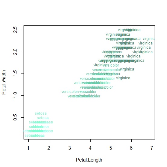
文字散布圖是直接用文字表達資料點的散布圖型態。在R Base中的做法是先將散布圖的類型設定為type="n"不要呈現任何資料點,再用text()加上文字。
     > plot(Petal.Length, Petal.Width, type="n")

     > text(Petal.Width~Petal.Length, labels=Species, cex=0.8, col=c("aquamarine","aquamarine3","aquamarine4")[Species])
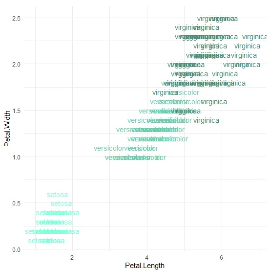
要在ggplot2製作文字散布圖只要利用geom_text()圖層就可以了。
     > p<-ggplot(iris, aes(x=Petal.Length, y=Petal.Width))+

     + geom_text(aes(color=Species),label=Species)+

     + scale_color_manual(values=c("aquamarine","aquamarine3","aquamarine4"))+

     + theme_minimal()+

     + theme(legend.position="none")

     > p
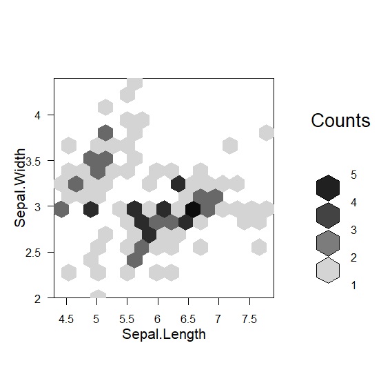
蜂巢圖
當資料太多的時候,散布圖上的點會重疊,密密麻麻看不清楚資料的情況。蜂巢圖是結合散布圖與次數分配的一種圖形,除了保留原本的資料散布情況,再透過六邊形來顯示資料重合的情形,看起來就像蜂巢一樣。R Base無法直接繪製蜂巢圖,需要額外安裝hexbin套件,用套件裡的hexbin()指令產出蜂巢圖。ggplot2則是用geom_hex()來完成蜂巢圖。
我們一樣以鳶尾花為例,這次以花萼長度與寬度當作變數,來示範蜂巢圖。先用hexbin()設定要分組的次數後,再用plot()畫出蜂巢圖。
     > hexbin<-hexbin(x=Sepal.Length, y=Sepal.Width, xbins=15)

     > plot(hexbin)
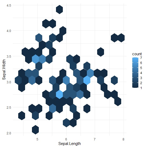
ggplot2直接用geom_hex()就能畫出蜂巢圖。
     > p<-ggplot(iris, aes(x=Sepal.Length, y=Sepal.Width))+

     + geom_hex(bins = 15)+

     + theme_minimal()

     > p