直方圖常被用來檢視資料分布的情況,適用於變數屬於連續變數的情況。hist()是R基本的直方圖指令,ggplot2裡的直方圖指令是geom_histogram()。因為是計算次數或機率,所以只需要在指令中輸入一個變數。
直方圖
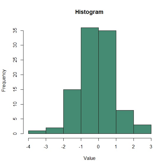
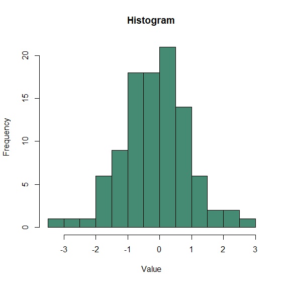
hist()繪製直方圖時,R會自動判斷資料的切點。breaks參數可自行設定資料切點。
     > data<-data.frame(value=rnorm(100))

     > hist(data$value, col="aquamarine4", main="Histogram", xlab="Value", ylab="Frequency")

     > hist(data$value, breaks=10, col="aquamarine4", main="Histogram", xlab="Value", ylab="Frequency")
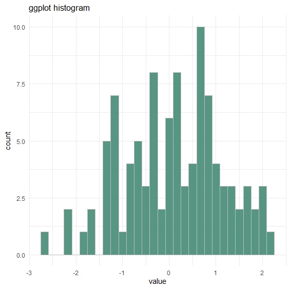
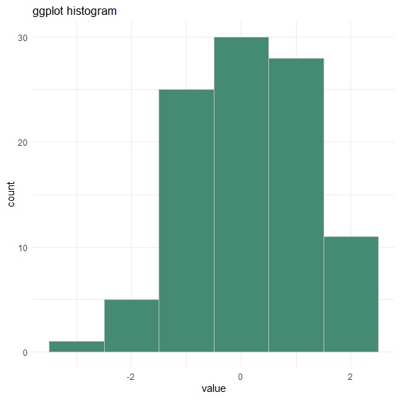
ggplot2的geom_histogram()繪製直方圖時,配合fill設定圖型顏色、color設定外框顏色,ggtitle設定標題文字,並指定theme_minimal()繪圖風格。binwidth則是調整資料切點的參數。
     > library(ggplot2)

     > p<-ggplot(data, aes(x=value))+

     + geom_histogram(fill="aquamarine4", color="grey", alpha=0.9)+

     + theme_minimal()+

     + ggtitle("ggplot Histogram")

     > p

     > p+geom_histogram(binwidth=1, fill="aquamarine4", color="grey")
群組直方圖
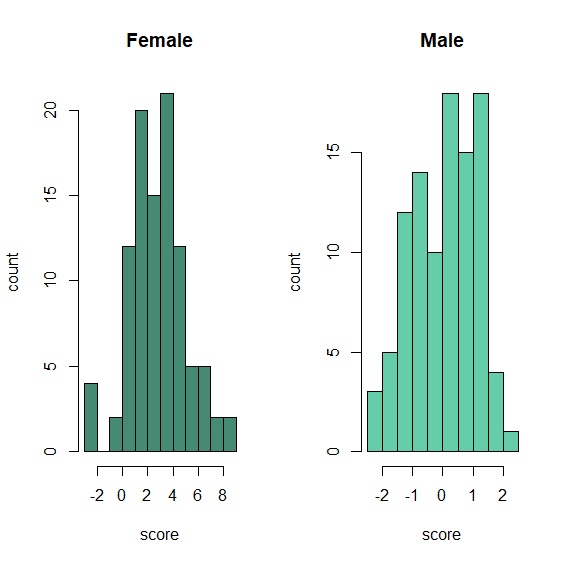
有時我們需要比較2個以上群組的次數分配,這時候將兩個群組以上的直方圖畫在一起是個好方法。R Base可以用par(mfrow())來分割畫面。
     > gender<-c(rep("Male",times=100), rep("Female", times=100))

     > score<-c(rnorm(100, mean=0, sd=1), rnorm(100, mean=3, sd=2))

     > data<-data.frame(gender, score)

     > library(dplyr)

     > Female<-filter(data, gender=="Female")

     > Male<-filter(data, gender=="Male")

     > par(mfrow=c(1,2))

     > hist(Female$score, col="aquamarine4", main="Female", xlab="score", ylab="count")

     > hist(Male$score, col="aquamarine3", main="Male", xlab="score", ylab="count")
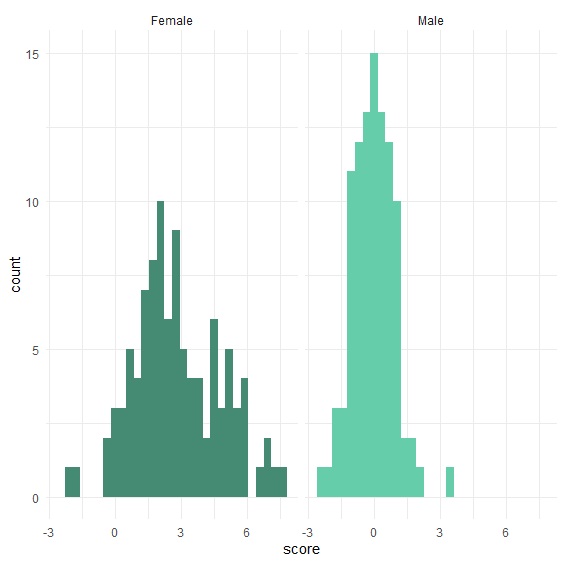
ggplot2則是用facet_wrap()。
     > gender<-c(rep("Male",times=100), rep("Female", times=100))

     > score<-c(rnorm(100, mean=0, sd=1), rnorm(100, mean=3, sd=2))

     > data<-data.frame(gender, score)

     > p<-ggplot(data, aes(x=score, fill=gender))+

     + geom_histogram()+

     + scale_fill_manual(values=c("aquamarine4", "aquamarine3"))+

     + theme_minimal()+

     + theme(legend.position="none")+

     + facet_wrap(~gender)

     > p
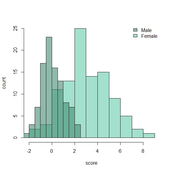
疊合密度圖
如果要創造疊圖的視覺效果,在R Base可以透過add=T參數並配合alpha透明度的設定來創造疊圖效果。
    > male<-c(rnorm(100, mean=0, sd=1))

    > female<-c(rnorm(100, mean=3, sd=2))

    > hist(female, breaks=10 ,col=rgb(0.4,0.8,0.67,0.6), xlab="score", ylab="count", main="")

    > hist(male, breaks=10, col=rgb(0.27,0.55,0.45,0.6), add=TRUE)

    > legend("topright", c("Male", "Female"), bty="n", cex=0.7, fill=c(rgb(0.27,0.55,0.45,0.6),rgb(0.4,0.8,0.67,0.6)))
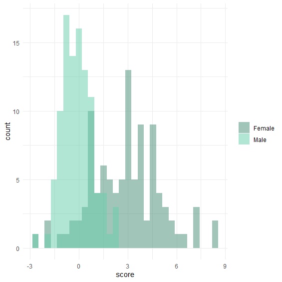
ggplot2當然也能創造出相同的疊圖效果。
     > gender<-c(rep("Male",times=100), rep("Female", times=100))

     > score<-c(rnorm(100, mean=0, sd=1), rnorm(100, mean=3, sd=2))

     > data<-data.frame(gender, score)

     > p<-ggplot(data, aes(x=score, fill=gender))+

     + geom_histogram(alpha=0.5, position="identity")+

     + scale_fill_manual(values=c("aquamarine4", "aquamarine3"))+

     + theme_minimal()+

     + theme(legend.title=element_blank())

     > p
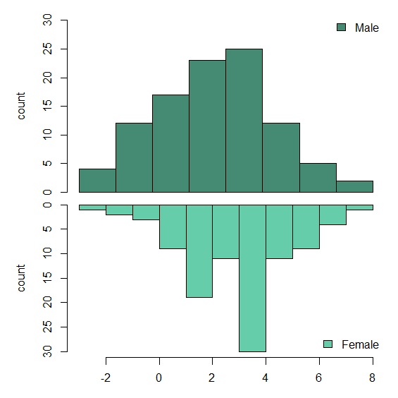
鏡像直方圖
另一種鏡像表示法,需先以par(mfrow(c=(2,1))將輸出分為2列1欄,再以par(mar=c(b,l,t,r))調整圖的位置。上方圖以xaxt="n"參數取消x軸,下方圖以ylim設定y軸由大到小,達到圖型顛倒的效果。
     > male<-c(rnorm(100, mean=0, sd=1))

     > female<-c(rnorm(100, mean=3, sd=2))

     > par(mfrow=c(2,1))

     > par(mar=c(0,5,1,1))

     > hist(male, main="", xlab="", ylab="count", xaxt="n", ylim=c(0,30), breaks=10, col="aquamarine4")

     > legend("topright", c("Male"), bty="n", fill="aquamarine4")

     > par(mar=c(3,5,0,1))

     > hist(female, main="", xlab="score", ylab="count", ylim=c(30,0), breaks=10, col="aquamarine3")

     > legend("bottomright", c("Female"), bty="n", fill="aquamarine3")
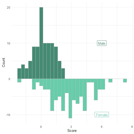
ggplot2的鏡像圖,需要注意將下方圖的y座標設為負號,並指定y軸以計數為單位。
     > male<-c(rnorm(100, mean=0, sd=1))

     > female<-c(rnorm(100, mean=3, sd=2))

     > data<-data.frame(male, female)

     > p<-ggplot(data, aes(x=x))+

     + geom_histogram( aes(x=male, y=..count..), fill="aquamarine4", color="grey")+

     + geom_label( aes(x=6, y=10, label="Male"), color="aquamarine4")+

     + geom_histogram( aes(x=female, y=-..count..), fill="aquamarine3", color="grey")+

     + geom_label( aes(x=6, y=-10, label="Female"), color="aquamarine3")+

     + xlab("Score")+

     + ylab("Count")+

     + theme_minimal()

     > p