大腦善於處理圖像不善於處理數字,好的統計圖表往往更容易解讀資料、呈現分析結果,降低理解數據的門檻。R在資料視覺化(Data Visualization)主要有Base、lattice、ggplot2三套系統。Base是R的基本繪圖套件,lattice與ggplot2則改善R Base的侷限可繪製出更精美的圖形,其中ggplot2更受到歡迎。這裡的介紹將以R Base為主但也會提及ggplot2。
這裡介紹的是R在資料視覺化的通用參數,這些參數可以設定視覺化圖表的樣式、線條粗細、圖表標題、座標軸、圖例等等。
類型
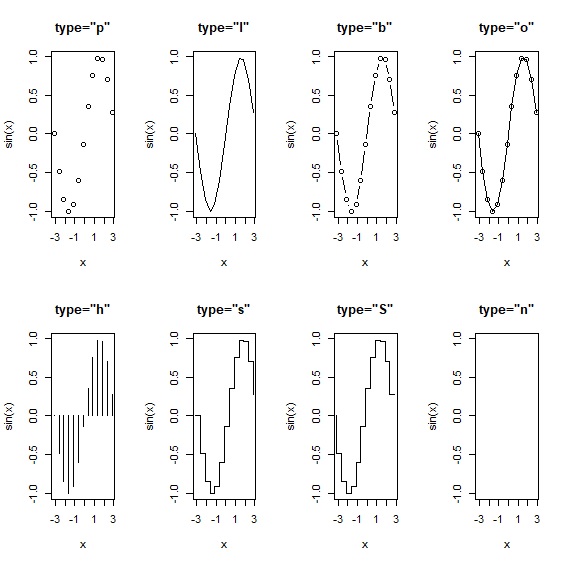
這裡的類型指的是點圖還是線圖。type參數設定圖形的種類,包含點圖、線圖、點線圖、階梯圖等等。
     > x<-seq(from=-pi, to=pi, by=0.5)

     > par(mfrow=c(2,4))

     > plot(x,sin(x), type="p", main='type="p"')
點
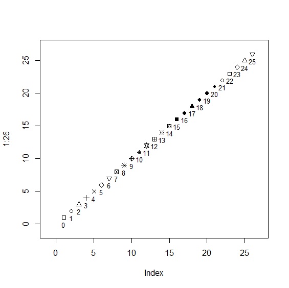
pch參數可以指定pch=0~25,共計26種點的樣式,用來呈現資料點的樣式。
     > plot(1:26,pch=c(0:25), xlim=c(-1,27), ylim=c(-1,27))

     > text(1:26, labels=c(0:25), pos=1, cex=0.8)
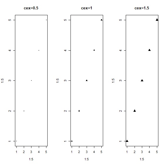
大小
cex設定點的大小,預設值是cex=1。cex=1.5相當於放大50%,以此類推。可以配合cex.axis、cex.lab、cex.main、cex.sub設定座標軸名稱與圖表標題大小。
> plot(1:5, 1:5, type="p", pch=17, cex=0.5, main="cex=0.5")
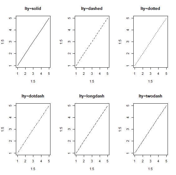
線
lty設定線的樣式,共有solid、dashed、dotted、dotdash、longdash、twodash可選擇。
> plot(1:5, 1:5, type="l", lty="solid", main="lty=solid")
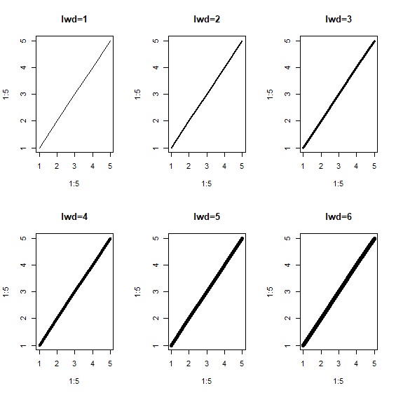
寬度
lwd設定線條寬度,預設值是lwd=1。
> plot(1:5, 1:5, type="l", lwd=1, main="lwd=1")
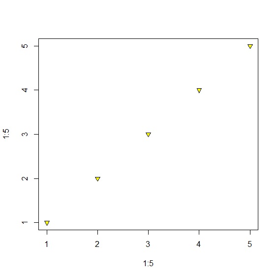
顏色
col與bg用來設定資料點、線條的顏色。配合pch=21~25的樣式,可以設定bg背景色。配合col.axis、col.lab、col.main、col.sub等參數可設定座標軸與圖表標題顏色。
> plot(1:5, 1:5, type="p", pch=25, col="black", bg="yellow")
座標軸
邊界
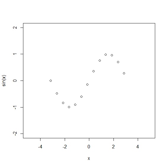
xlim與ylim設定x、y座標軸的上下界。
> plot(x, sin(x), xlim=c(-5,5), ylim=c(-2,2)
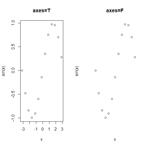
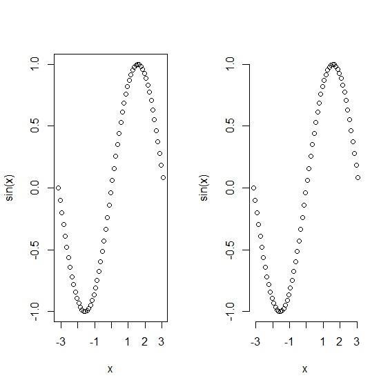
顯示/隱藏
axes設定座標軸顯示或隱藏。當axes=TRUE時座標軸顯示,反之aexs=FALSE時隱藏座標軸。必須注意的是,axes只針對座標軸,當座標軸隱藏的時候,座標軸的名稱仍然存在。axes=FALSE與ann=FALSE一同使用時可以顯示沒有任何座標軸與文字的乾淨圖案。
     > plot(x, sin(x), axes=TRUE, main="axes=T")

     > plot(x, sin(x), axes=FALSE, main="axes=F")
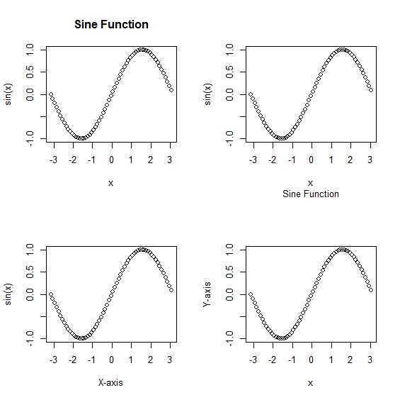
標題
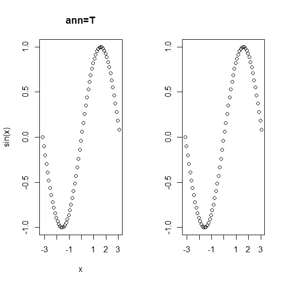
main、sub、xlab、ylab分別設定圖表的主標、副標、x軸名稱與y軸名稱。ann則設定標題是否顯示,ann=TRUE時顯示圖表標題與、x軸名稱、y軸名稱,反之不顯示。axes=FALSE與ann=FALSE一同使用時可以顯示沒有任何座標軸與文字的乾淨圖案。
     > plot(x, sin(x), main="Sine Function")

     > plot(x, sin(x), sub="Sine Function")

     > plot(x, sin(x), xlab="X-axis")

     > plot(x, sin(x), ylab="Y-axis")

     > plot(x, sin(x), ann=TRUE, main="ann=T")

     > plot(x, sin(x), ann=FALSE, main="ann=F")
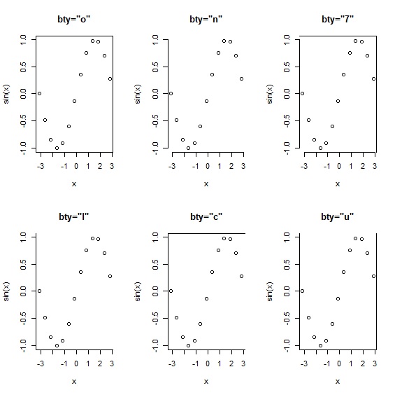
框線
bty設定圖形輸出的外框,共有6種型態。frame.plot則是邏輯值,當frame.plot=TRUE時,圖表會加上外框線;反之則只顯示座標軸。
     > x<-seq(from=-pi, to=pi, by=0.5)

     > par(mfrow=c(2,3))

     > plot(x,sin(x), bty="o", main='bty="o"')

     > par(mfrow=c(1,2))

     > plot(x, sin(x), frame.plot=TRUE)

     > plot(x, sin(x), frame.plot=FALSE)
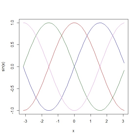
多重線條
lines()指令可以在原圖上增加作圖,創造出疊圖效果。
     > x<-seq(from=-pi, to=pi, by=0.5)

     > plot(x, sin(x), type="l", col="blue")

     > lines(x, cos(x), col="red")")

     > lines(x, -sin(x), col="darkgreen")

     > lines(x, -cos(x), col="violet")
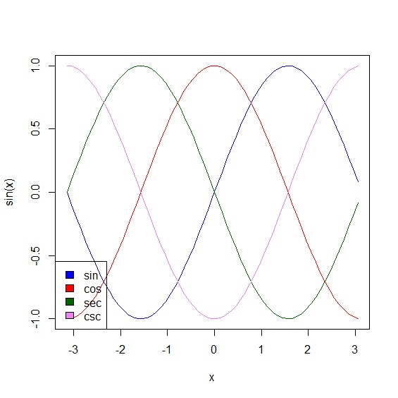
圖例
legend()指令處理圖例,也可以搭配lty、cex、bg等參數,設定圖例的樣式。
> legend("bottomleft", c("sin", "cos", "sec", "csc"), fill=c("blue", "red", "darkgreen", "violet"))
文字
text()可以在圖上增加文字。
位置
文字的位置透過座標軸的x與y來設定。
> text(x=1,y=10, labels=c("文字內容"))
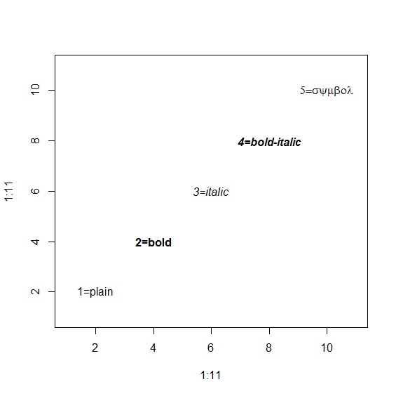
字體
font參數設定粗體、斜體、斜粗體。搭配font.main、font.sub、font.lab、font.axis可以設定圖標題與座標軸的字型。
      > plot(1:11, 1:11, type="n")

      > text(x=2,y=2, labels=c("1=plain"), font=1)

      > text(x=4,y=4, labels=c("2=bold"), font=2)

      > text(x=6,y=6, labels=c("3=italic"), font=3)

      > text(x=8,y=8, labels=c("4=bold-italic"), font=4)

      > text(x=10,y=10, labels=c("5=symbol"), font=5)
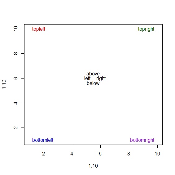
標籤與對齊
labels以及pos分別設定文字標籤與對齊方向。pos參數從1~4分別是靠下、靠左、靠上、靠右對齊。
     > plot(1:10, 1:10, type="n")

     > text(x=1,y=1, labels=c("bottomleft"), pos=4, col="blue")

     > text(x=1,y=10, labels=c("topleft"), pos=4, col="red")

     > text(x=10,y=10, labels=c("topright"), pos=2, col="darkgreen")

     > text(x=10,y=1, labels=c("bottomright"), pos=2, col="purple")

     > text(x=5.5,y=6, labels=c("below"), pos=1, col="black")

     > text(x=5.5,y=6, labels=c("left"), pos=2, col="black")

     > text(x=5.5,y=6, labels=c("above"), pos=3, col="black")

     > text(x=5.5,y=6, labels=c("right"), pos=4, col="black")
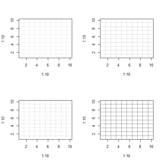
格線
grid()用來增加圖的格線。
     > plot(1:10,1:10, type="n")

     > grid(10,10)

     > grid(10,10, lty="solid")

     > grid(10,10, lwd=2)

     > grid(10,10, col="black")