長條圖的用途是顯示類別變數的次數分配,與直方圖用於表示連續變數的次數或機率分配有明顯不同,所以長條圖不能轉換成密度圖。
長條圖
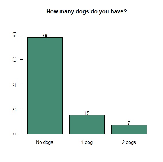
barplot()是R Base繪製長條圖的指令,通常需要搭配table()計數,如果要替每個長條取名稱,可使用names.arg參數。要增加數值,先將變數轉換為字串後再利用text()加上。
     > data<-read.csv("c:/Users/USER/downloads/customer.csv", header=T, sep=",")

     > count<-table(data$pets_dogs)

     > p<-barplot(count, col="aquamarine4", ylim=c(0,90), names.arg=c("No dogs", "1 dog", "2 dogs"), main="How many dogs do you have?")

     > text(p, y=count+2, labels=as.character(count))
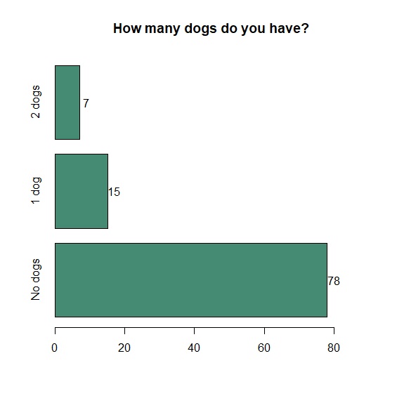
當然,我們也可以把圖改為橫式,只要設定horiz=T即可。
     > p<-barplot(count, col="aquamarine4", horiz=T, xlim=c(0,90), names.arg=c("No dogs", "1 dog", "2 dogs"), main="How many dogs do you have?")

     > text(p, x=count+2, labels=as.character(count))
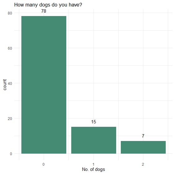
ggplot2的長條圖指令是geom_bar(),再用geom_text()加上資料標籤,使用vjust、hjust調整垂直、水平平分距離。
     > p<-ggplot(data, aes(x=pets_dogs))+

     + geom_bar(color="aquamarine4", fill="aquamarine4")+

     + xlab("No. of dogs")+

     + theme_minimal()+

     + ggtitle("How many dogs do you have?")+

     + geom_text(stat="count", aes(label=(..count..)), vjust=-1)

     > p
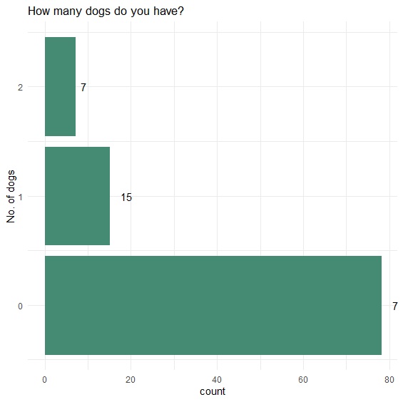
直條圖轉換成橫條圖的時候,只需加上coord_flip()。
     > p<-ggplot(data, aes(x=pets_dogs))+

     + geom_bar(color="aquamarine4", fill="aquamarine4")+

     + xlab("No. of dogs")+

     + theme_minimal()+

     + ggtitle("How many dogs do you have?")+

     + geom_text(stat="count", aes(label=(..count..)), hjust=-1)+

     + coord_flip()

     > p
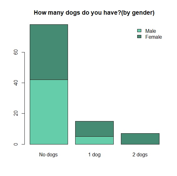
堆疊長條圖
堆疊長條圖的畫法直接在table()裡設定分組變數,再用barplot()繪圖。
     > count<-table(data$gender, data$pets_dogs)

     > barplot(count, main="How many dogs do you have?(by gender)", col=c("aquamarine3", "aquamarine4"), names.arg=c("No dogs", "1 dog", "2 dogs"))

     > legend("topright", c("Male", "Female"), bty="n", fill=c("aquamarine3", "aquamarine4"))
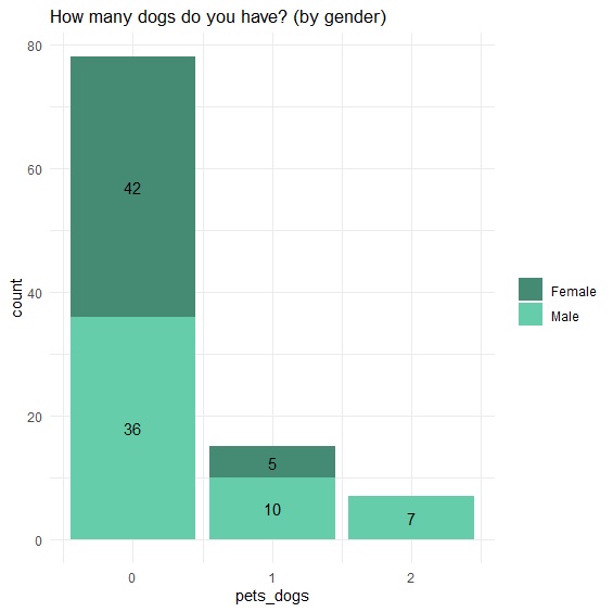
ggplot2堆疊長條圖的繪圖法:
     > p<-ggplot(data, aes(x=pets_dogs, fill=as.factor(gender)))+

     + geom_bar()+

     + scale_fill_manual(label=c("Female", "Male"), values=c("aquamarine4", "aquamarine3"))+

     + theme_minimal()+

     + ggtitle("How many dogs do you have? (by gender)")+

     + theme(legend.title=element_blank())+

     + geom_text(stat="count", aes(label=..count..), position=position_stack(vjust=0.5))

     > p
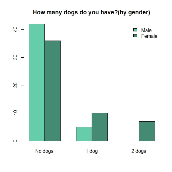
群組長條圖
R Base群組長條圖的畫法直接用beside=TRUE設定。
     > barplot(count, beside=TRUE, main="How many dogs do you have?(by gender)", col=c("aquamarine3", "aquamarine4"), names.arg=c("No dogs", "1 dog", "2 dogs"))

     > legend("topright", c("Male", "Female"), bty="n", fill=c("aquamarine3", "aquamarine4"))
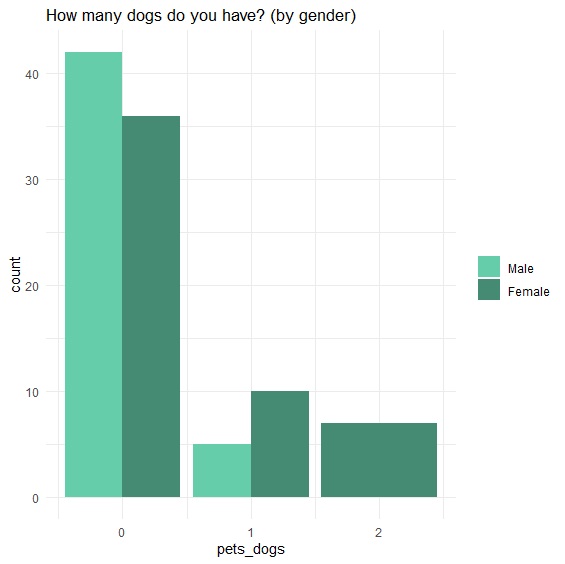
ggplot2的群組長條圖與堆疊長條圖的差異,在於position="dodge"參數設定。
     > p<-ggplot(data, aes(x=pets_dogs, fill=as.factor(gender)))+

     + geom_bar(position="dodge")+

     + scale_fill_manual(label=c("Male", "Female"), values=c("aquamarine3", "aquamarine4"))+

     + theme_minimal()+

     + theme(legend.title=element_blank())+

     + ggtitle("How many dogs do you have? (by gender)")

     > p